
The Psychology of Color in Web Design and Its Impact on User Perception
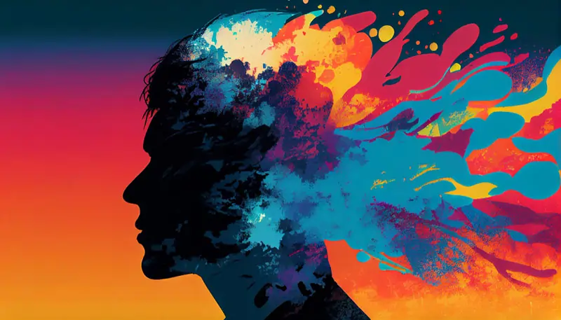
When it comes to web design, it’s not just about aesthetics. It’s about creating an emotional connection with users and guiding them towards desired actions. One powerful tool that web designers can leverage is the strategic use of color. Colors have the ability to evoke emotions, convey messages, and shape user perceptions. Understanding the psychology of color and its impact on user perception is essential in creating effective and engaging web designs. In this article, we will explore the psychology of color and its significance in web design.
Colors have inherent meanings and associations that are deeply rooted in human psychology. They have the power to trigger specific emotions and influence our behavior and decision-making. By strategically choosing colors for web design, designers can tap into these human responses and create an atmosphere that supports and enhances the desired user experience.
Let’s explore the impact of different colors commonly used in web design:
1. Red:
Red is a bold and energetic color that symbolizes passion, urgency, and excitement. It grabs attention and evokes strong emotions. It’s often used to create a sense of urgency or to make elements stand out. However, it’s important to be cautious with the use of red as it can be overwhelming or create a sense of danger if used excessively.
2. Blue:
Blue is a calming and trustworthy color. It represents trust, stability, and reliability. It’s frequently used by brands to portray professionalism and establish a sense of security. Blue is also associated with cleanliness and is often used in healthcare and financial websites. It’s important to note that different shades of blue can evoke different emotions, with darker blues creating a more serious tone and lighter blues conveying a sense of tranquility.
3. Yellow:
Yellow is a cheerful and optimistic color. It represents happiness, warmth, and energy. It’s often used to grab attention and create a sense of positivity. Yellow can be a great choice for brands that want to convey a sense of creativity and playfulness. However, it’s important to use yellow in moderation, as excessive use can be visually overwhelming and create a sense of anxiety.
4. Green:
Green is a color associated with nature, growth, and harmony. It conveys feelings of freshness, health, and tranquility. Green is commonly used by brands in industries such as health, wellness, and eco-friendly products. It’s a versatile color that can be used to create a sense of balance and calmness.
5. Orange:
Orange is a vibrant and energetic color that combines the warmth of red and the happiness of yellow. It represents enthusiasm, creativity, and friendliness. Orange is often used to create a sense of excitement and draw attention to specific elements. It can be a great choice for brands that want to convey a sense of energy and playfulness.
6. Purple:
Purple is a color associated with royalty, luxury, and creativity. It represents sophistication and elegance. Purple can create a sense of calmness and serenity, making it a popular choice for brands in the beauty, fashion, and creative industries.
7. Pink:
Pink is a color often associated with femininity, sweetness, and romance. It represents compassion and nurturing. Pink can create a sense of playfulness and youthfulness and is commonly used in industries targeting a female audience.
Understanding the psychology of color is crucial, but it’s also essential to consider cultural and personal interpretations of colors. Different cultures may associate different meanings with certain colors, so it’s important to take that into account when designing for a global audience. Additionally, individuals may have personal associations with colors based on their own experiences and preferences.
In web design, the strategic use of color goes beyond selecting a pleasing color palette. It involves considering the target audience, the purpose of the website, and the desired emotional response. By carefully choosing and com
bining colors, web designers can create an atmosphere that supports the intended message, guides user behavior, and enhances the overall user experience.
Here are some tips for incorporating color psychology into web design:
1. Consistency: Maintain a consistent color scheme throughout the website to create a cohesive and visually appealing experience. This includes using consistent colors for buttons, links, headings, and other elements.
2. Contrast: Use contrasting colors to make important elements stand out and guide users’ attention. High contrast can help draw attention to calls to action and important information.
3. Color Hierarchy: Use color to establish a visual hierarchy. By assigning different colors to different levels of importance, you can guide users’ attention and help them navigate the website more easily.
4. Color Accessibility: Consider color accessibility guidelines to ensure that your chosen color palette is accessible to users with visual impairments. Contrast ratios between text and background are important to consider for readability.
5. Brand Association: Align the chosen color palette with the brand’s identity, values, and target audience. Consistency with the brand’s offline presence can help strengthen brand recognition and perception.
In conclusion, the psychology of color in web design is a powerful tool that can deeply influence user perception, emotions, and behavior. By understanding the meanings and associations of colors, web designers can strategically select and combine colors to create engaging, user-centric experiences. However, it’s important to consider cultural and individual interpretations of color and to remember that color should be used in harmony with other design elements to create a cohesive and impactful user experience. So, next time you embark on a web design project, don’t underestimate the power of color psychology!
Our Services
1 Comment. Leave new
[…] reflects your brand identity, additional customization will be necessary. Customizing the design, color scheme, typography, and layout to align with your branding guidelines requires more time and effort from […]